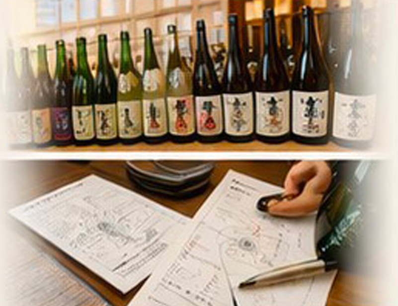
Japanese Sake Diagram

A new experience that "visualizes" the taste

What is the Japanese Sake Diagram?

Visualizing the sensory experience of drinking sake

Unlike common vertical/horizontal mapping charts, this diagram expresses the drinking experience on a timeline—starting from the aroma, then how it feels in the mouth, how it goes down, and the aftertaste. Taste is subjective, but by using the Japanese Sake Diagram, we believe that around 70% of the flavor perception can be expressed objectively.

Understandable even for beginners and foreigners

Since the diagram visualizes the drinking experience, even those who cannot do tastings or are unfamiliar with the different brands can still grasp the characteristics and overall impression of the sake.

Helps customers enjoy sake more!

By visually confirming the overall flavor profile and differences between brands, customers can compare while drinking and enjoy sake more deeply.
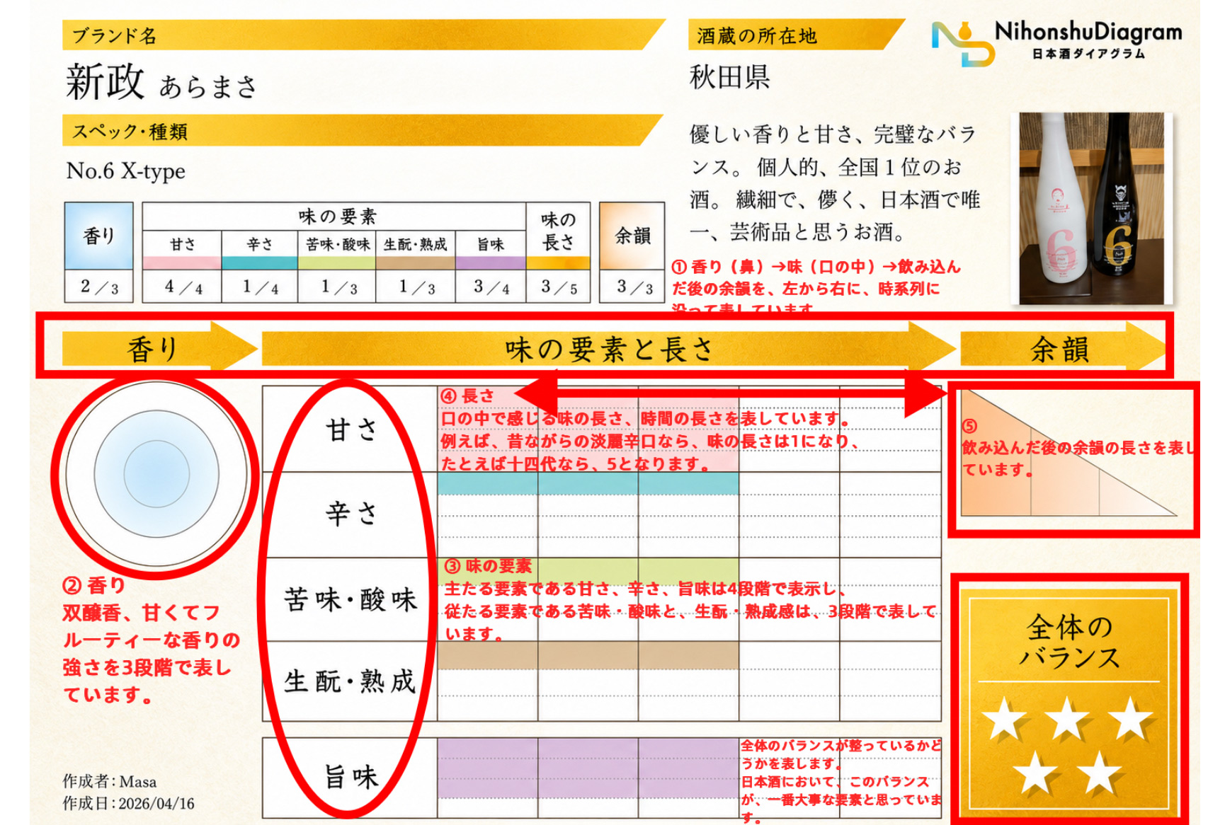
How to Read the Chart

Download the PDF to use it

Download PDF

For Restaurants and Retailers

If you are interested in using the Japanese Sake Diagram,
please feel free to contact us!
(Instagram DM)

Instagram QR

@NIHONSYU_DIAGRAM

Stores Currently Using the Diagram

【Tokyo】 Shinjuku – Gango Oyaji

Reservation at Ganko Oyaji – Shinjuku / Tabelog →

Profile, Concept & Development Background

開発ストーリー

Development Background

When I drank sake, I often saw typical menu descriptions in izakayas using vertical/horizontal charts, sake meter values, or acidity levels. However, these were not very helpful for me in terms of understanding the actual taste.

There were cases where sweet sake felt spicy, or dry sake tasted sweet. Some sake went down smoothly, while others felt uncomfortable. I couldn't clearly distinguish between "clean and sharp" versus "light and dry." I felt that my actual drinking experience did not match the explanations commonly provided.

Even when reading online reviews, many descriptions were subjective, such as "melon-like aroma," and I couldn't find explanations that were objective and convincing.

With these doubts in mind, during several years of the COVID period, I stocked up on top 50-level sake from across Japan at home. I compared 3 to 8 types daily, almost 360 days a year, conducting thorough tasting comparisons.

Through this process, I developed the ability to break down the drinking experience into timelines and flavor components, which led to the creation of the Japanese Sake Diagram.

開発者の思い

Why This Matters

The decline in sake consumption is partly due to changes in alcohol culture, dietary habits, and lower alcohol preferences. However, another major reason is that people cannot understand or evaluate sake—and there is no one to teach them.

Because people don't understand it well, they often just say "dry" at restaurants to avoid embarrassment. But this prevents them from truly enjoying sake.

The Japanese Sake Diagram allows even beginners, people who cannot taste professionally, and foreigners to understand the overall flavor and differences between brands—making sake more enjoyable.

Before releasing the diagram, I shared it with many acquaintances (especially foreigners) to explain sake flavors. The response was overwhelmingly positive—almost 100% approval. This confirmed that the diagram meets an existing need, rather than creating something unnecessary.

Through the Japanese Sake Diagram, I hope people can learn how to enjoy sake and connect sake lovers around the world.

Creator Profile

Masayasu Amano

  • Certified Public Accountant, Tax Accountant, and Administrative Scrivener. Runs a CPA firm in Shinjuku.
    CVC Accounting Office cvc-ac.com
  • Developed the Japanese Sake Diagram as a passionate sake enthusiast.
  • Hobbies: Japanese sake, tennis, workouts, karaoke, martial arts
  • Favorite sake: Aramasa No.6 X-type
天野 正康